ProAct
Rethinking the ProAct navigation experience
ProAct
Navigation Redesign
ProAct Analytics is a healthcare analytics tool that aids clinical and financial risk analysis, and management of a population. The tool was acquired by Relias in 2016, during its acquisition of Care Management Technologies, and needed to be implemented into Relias’ product suite. The project aimed to retrofit the ProAct interface into a more user-friendly tool that also embodies Relias’ company ethos and brand identity.
Role: UX Designer
Time: 4 weeks
Result: Live release

Redesigning ProAct’s Navigation
For this project, I was responsible for exploring new top navigation concepts for the ProAct dashboard, and to incorporate a color scheme that aligned with the Relias brand. This was proposed as a quick turnaround project, but I decided to confirm current user pain points in the system by speaking with internal stakeholders. From there, I developed new navigation concepts, and a color scheme that emphasizes secondary colors from the Relias brand. My goal for this project was to visually incorporate ProAct into the Relias product suite while improving app-wide usability.
Design Problem
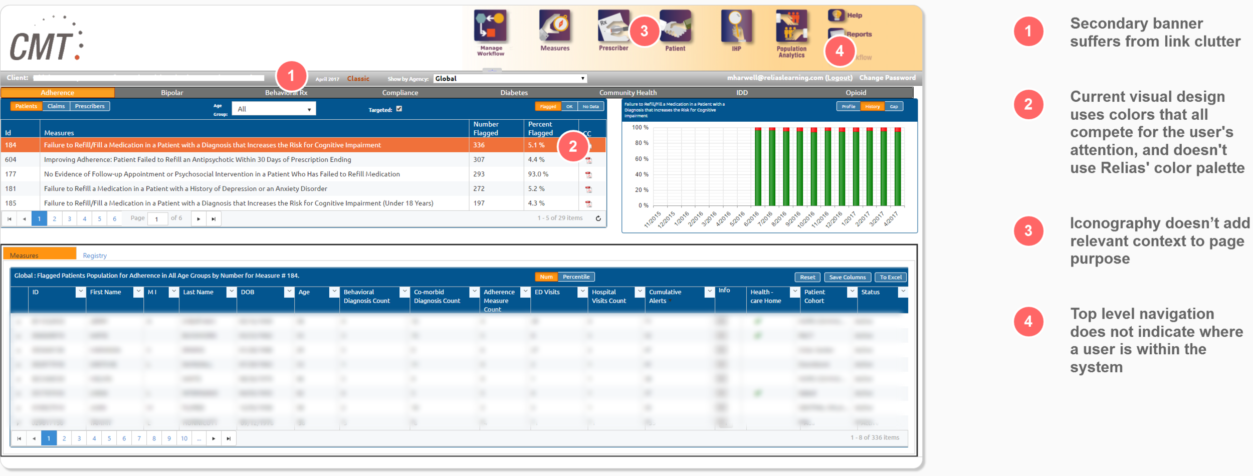
ProAct suffers from a cluttered interface that confuses users instead of adding clarity to their actions. Additionally, the platform’s visual identity does not conform to the Relias brand.
Landing Page Usability
After meeting with the product owner of the platform, we were able to identify the key areas that needed to be reworked for a short-term fix of the interface. The following usability issues stem from our own evaluation, as well as prior customer feedback.

Interaction Design
I made the decision to get rid of the icons in favor of keeping just the words. This way, I could add a highlight and an underline to indicate which page a user was currently visiting within the system. When hovering over other options, the underline will follow the cursor, while keeping the current page highlighted. This way, users will always know the page they're on, even when hovering over other options.

Brand Identity
When thinking about brand identity, we knew this wasn’t going to be a direct extension of Relias’ LMS platform, so we didn’t want to use that same color palette. Instead, we decided to make use of other colors in Relias’ color palette, instead of the dominant green seen throughout the LMS.

Result
The updated landing page uses a color scheme that more closely associates itself with the Relias brand and is a lot easier to look at than its previous iteration. Additionally, the top navigation clearly indicates where a user is within the site, without the need for arbitrary icons.

What I learned
In many cases, the UX of the healthcare world is in need of a drastic overhaul. While I only had the opportunity to rework ProAct’s primary navigation and color scheme, there were areas on several other pages that needed to be reassessed. If I were to revisit this project, I’d like evaluate other areas of the system, and conduct a heuristic evaluation of the different processes users need to carry out on a daily basis. In healthcare, a simple user error in a system carrying sensitive patient information could mean a breach of HIPPA compliance. I’m glad I had the opportunity to work on this project, as it gave me a better appreciation for how important of a role UX needs to play in healthcare.
