Relias
A redesign of Relias’ report generation workflow
Relias
Reports Dashboard Redesign
The Relias Learning Management System (RLMS) is a service that offers courses and training to healthcare professionals. The reports section of the LMS allows users to track compliance, engagement, and performance across their organization. A site redesign effort was set forth to address common user pain points, and to incorporate information visualization to accompany raw data generated from reports.
Role: UX Designer
Time: 6 Months
Result: High-Fidelity Mockups

Redesigning Relias Reports
As a newly minted designer at Relias, I was tasked by PMs to begin prototyping solutions for a redesign to the reporting interface of the learning management system. Before jumping into the design, I thought it best to begin with exploring the user need for an interface redesign. As the sole designer for this project, I was responsible for taking conceptual ideas from generative research to wireframes to a high-fidelity prototype. My goals for this project were to improve navigation, scale the platform for new acquisitions, and make the report creation a more delightful experience.
Design Problem
RLMS users are having difficulty navigating the reports page due to link clutter and poor content strategy. The result has led to an increase in user cognitive load, and an increase in client support call volume.
Research

Implementation Calls
Implementation calls are typically set up with new clients to help onboard them to the RLMS, and teach them the various ins and outs of the system. These calls proved to be a valuable source of client first impressions and reactions to being introduced to the system for the first time.

Interviews
To learn more about the legacy reports workflow, I consulted both client success managers and product managers of the platform. Interviews with these stakeholders revealed more detail on overall site usability due to their frequent interactions with clients.
Key Findings
Legacy reports interface is too cluttered
Users have difficulty learning the system in one sitting
User's don't like having to scroll down several categories to find their report
Users commonly run into errors when running a report due to poor content strategy
Too many things to look at, and feel overwhelmed
Usability Issues
After conducting the above preliminary research, the following points stood out as the key areas to be reassessed when carrying out the reports page redesign.

Navigation Scaling
To address the top navigation clutter, I decided to introduce a sidebar navigation to account for Relias’ growing product suite. My proposal received buy-in from key stakeholders, so I made it a point to include the sidebar in my wireframes for usability testing. Working with another designer, we were able to iterate navigation ideas until we settled on the for the third iteration. The following designs showcase the evolution of the sidebar based on client feedback and usability testing sessions.


Content Strategy
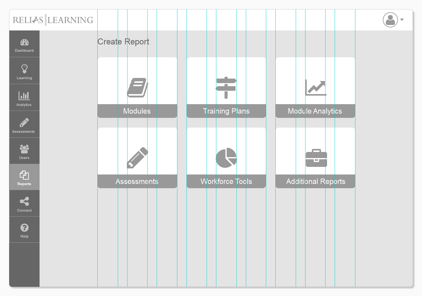
The first iteration of my redesign included a tile grid layout, with each tile representing a different grouping of report types. This iteration was intended to focus on the following:
Organization: To view multiple report types in the past in the legacy RLMS, users would have to scroll through a seemingly endless list of report types. Now they are bundled together so users don’t need to scroll.
Clarity: Tile groupings use simpler, more relevant, language for categorizing report types.
Scalability: With the addition of new features from company acquisitions, new reports will be needed, and the tile design offers room to expand on current legacy report types without compromising much screen space.
Mid-Fidelity Mockups
With the initial research and ideation out of the way, I had time to begin exploring how these pieces would come together to improve the reporting experience. I put together a series of mid-fidelity wireframes that focused on simplifying the report creation process and the interactions involved with it. After making each screen interactive, the mockups were ready for usability testing.

Usability Testing
After reviewing the interaction flow of the prototype, I came up with a series of tasks that would be used to evaluate the effectiveness of the design and its flow.

Key Findings
Users generally took 2-3 clicks before figuring out which tile to click on
Tile grouping use unfamiliar simpler terminology that is not recognized
Users don’t know how to access legacy report types
Tile naming conventions unintuitive
Users want to see graphs to track compliance
Love having saved reports on their own page

Hybrid Card Sort Activity
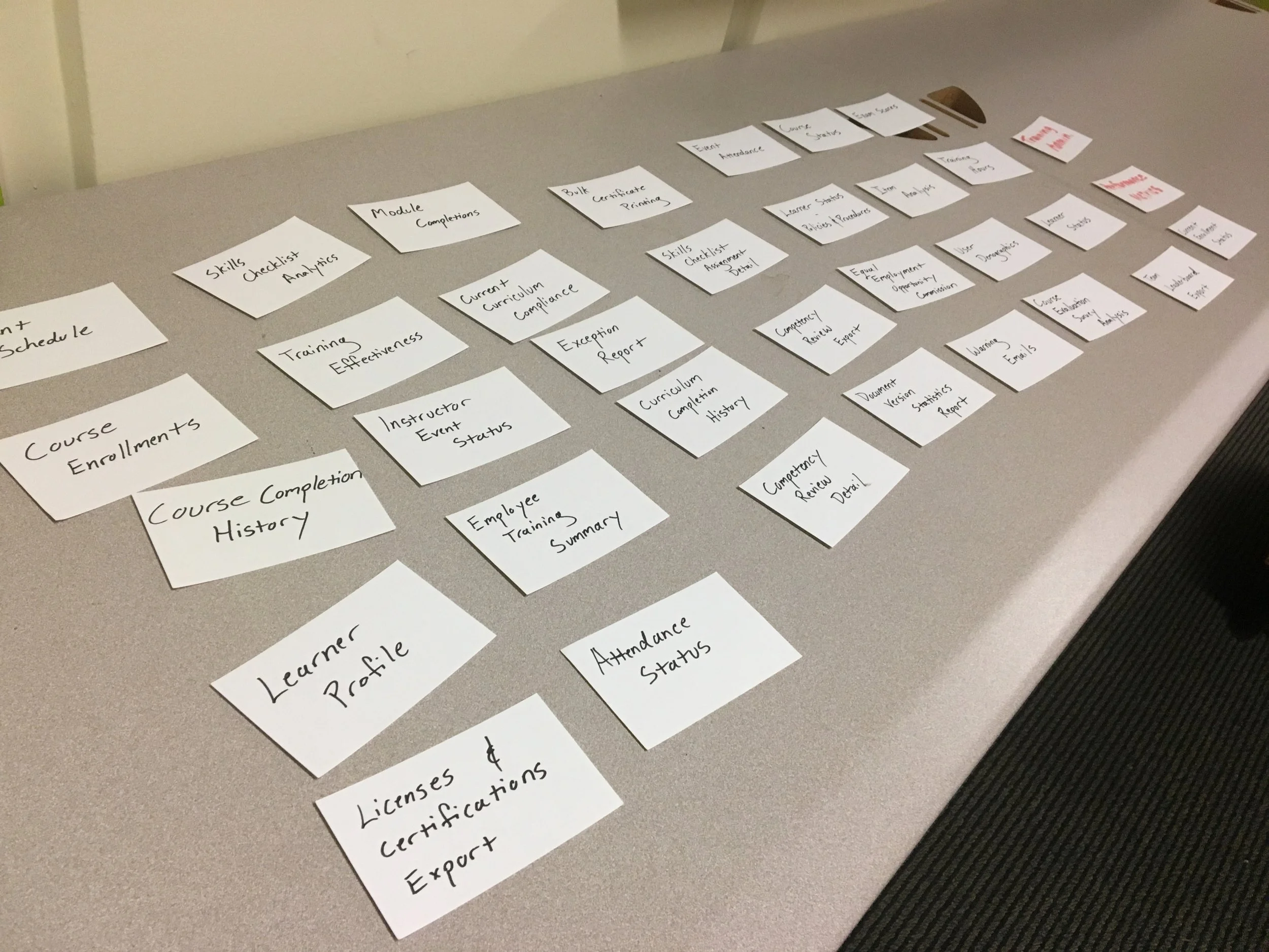
From the usability testing sessions conducted above, it was clear that we needed to rethink the usability of having a tile layout. To confirm this, I decided to conduct a hybrid card sort activity with various stakeholders including client organizations and internal teams. By getting both perspectives, I would be able to get a more holistic view of how Relias' report types are viewed.
Key Findings
Using simpler terminology to group legacy report names with complex naming conventions was creating more confusion than it was helping with organization. Both internal teams and client participants were grouping report types in unrelated tile groupings, or creating new report groupings that were unrelated to the report types being placed under them.
It became clear that the legacy system’s report type naming conventions made it difficult to categorize them using simpler language. As result, I determined that a tile format was the wrong way to group report types.

Re-evaluating the design
After consolidating feedback from our usability testing sessions and card sort activities, I organized a whiteboarding session to rethink the layout of the reports' page and process. We used the meeting to think about how the reports page can fit the design of the rest of the RLMS, as it’s legacy layout was very different from the layout of the rest of the site. As a result, we decided to give the reports workflow a similar layout and hierarchy as the RLMS’ course creation process; a process recognized by the majority of Relias users.
Accessibility
With the redesign, I wanted to ensure the RLMS was able to properly reflect Relias’ brand identity using the company’s color palette. However, the use of some colors didn’t provide proper contrast when given an overlay of white text. With the help of the other UX designer, we were able to agree upon the following darker versions of the Relias color scheme to maintain a visually accessible interface.

Visual Design
The goal of the visual design was to apply our new design strategy to the earlier wireframes, and convert them into high-fidelity visuals for presentation and buy-in from senior leadership. The style of the design was based on the brand identity and hierarchy discussed in the whiteboarding meeting.
What I learned
It pays to always stay at least two steps ahead of your development team when working on a new design. Integrating the UX process into an agile environment can be tricky, so it was important, especially with this project, to make sure I had research done to validate my design decisions for engineering before they began building.
When conducting usability testing sessions, I found it to be an incredibly insightful experience to invite product managers and even developers to sit in and listen. It’s a great way for other stakeholders to learn about user perceptions on the products we’ve all been striving to build, and keep everyone on the same page.
As the high-level product vision changes, so too does the smaller, more niche projects. The UX process isn’t one size fits all, so it’s important to keep an open mind, adapt, and always listen.
